
Some of you may have noticed that Best Bass Gear has started to use its new logo. It’s not being used everywhere just yet, but is being transitioned in.
Does the logo have a story behind it? Yes, it does.
The original BBG logo was nothing but white letters on a blue background. It was stolid, terse and not very distinctive, but it worked.
The new design is a bass body shape that Max Kay came up with that he terms as being a “Thundercaster”. And contrary to what some may think, the shape does balance out well. When worn on a real instrument made in that shape, there is no neck dive whatsoever.
Even though bass is in the name, BBG did want the shape to be recognized even from a distance where you couldn’t make the letters out. The Thundercaster shape along with the 4 strings seen and the 4 tuners seen at right made that possible.
And yes, the headstock is in fact an ear turned on its side.
The rest of the logo did in fact come from you, the Best Bass Gear customer. We did ask around what people liked for logos and incorporated a few ideas here and there for the finalized logo.
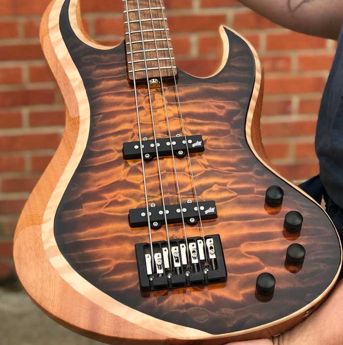
Did the “Thundercaster” shape ever make its way to a real bass?
Indeed it did. Here’s one that Chris Stambaugh built:

So yes, the BBG logo does in fact exist as a real instrument.
What do you think?
We think our new logo works a lot better than our old one did, but what do you think? Let us know by posting a comment or two.

I’m not crazy about it…but…Best Bass Gear is just that, the best. You guys could use a clown face, I’d still buy gear from you 🙂
Its cool. I want stickers of it.
I don’t care about the logo one way or the other. Just like your toys!
love it!
I like it a lot, except for the ‘ear’ as the headstock. Something less ‘busy’ would be preferable (to me).
Chris Stambaugh did a fine job…It looks like a perfectly balanced bass…Aside from sound, that’s the most important consideration for me… She could be the hottest in the world but if she doesn’t inspire passion and make me feel comfortable: what’s the point?!? The logo’s cool, too…;)
Logo is good and yes a sticker of it should go out w/anything purchased. The Stambaugh is a groovy take on a Fenderbird and looks like it addressed the neck-dive issue nicely. Only part I’m not keen on is the pickguard shape in the upper horn area. Details, details… bet it sounds huge w/the Darkstars!
Sort of like a sideways flying V, or maybe a diving V. Bass is down, so that works…
Nice logo.