

When it comes to 1950s and 1960s design, that’s something pretty easy to figure out. If you do an image search for googie architecture, you will see many, many examples of that “swoopy” style that began in the 1940s and lasted all the way into the mid-1960s. Everything from houses to furniture to cars and many other things all had googie style to them.
But then there’s the 1970s. Very different.
What exactly makes for a 1970s look when it comes to bass guitar design?
While there isn’t a checklist of must-have design cues, there are few things that do apply. Here are a few of them.
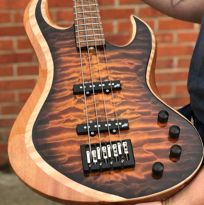
Natural, super-shiny finish (a.k.a. looks-like-a-coffee-table)
Natural finishes started appearing often in the ’70s as a means of cost-cutting, as it was cheaper to have guitar bodies coated with just a sealant rather than paint them. These natural-finish guitar bodies appeared so much that it pretty much became a staple of ’70s-inspired guitar design.
The urethane coats put on these guitar bodies were rather thick and had a very glossy look to them.
Fancy block fretboard inlays
Although the Fender Jazz Bass started getting block inlays around 1966 or 1967, blocks are generally seen as being a ’70s design cue.
Yes, it is true other basses stayed with the dot markers, such as the Precision Bass and basses made by Music Man. But for something that says “I’m from the ’70s,” block inlays definitely work.
Maple neck/fretboard or 1-piece maple neck
In the ’60s, rosewood boards were everywhere. In the ’70s, maple came back with a vengeance.
For that super-’70s look, a maple neck/fretboard that’s been tinted to a yellow-ish (as is “butterscotchy”) color works very well.
Shiny metal knobs
Metal, metal and more metal. Not the music, the knobs. We carry just about all the knobs you would ever want for a ’70s look. Whether you want domed or beveled, concentric or not, we have them.
“More metal” was definitely a theme of many ’70s bass guitar designs, to be sure, which leads to…
Big huge bridge
Many bass guitar designs of the ’70s were outfitted with bridges that dwarfed the ones seen in the ’60s.
An example of the is the Peavey T-40 bass:

Metal, metal, metal everywhere. Big, beefy, large and in charge.
We recommend a Hipshot bridge instead. Still beefy (depending on which model you get,) but a lot more civilized. 🙂
Brass (the color)
Another staple of ’70s design was a “dark gold” color for the metal portions of the instrument, better known as a brass color. This color is not-exactly-gold and not-exactly-bronze. It’s brass, and there’s really no other way to describe it.
It was common that on “special edition” instruments of the era, anything metal was of a brass color. The bridge, the knobs, the switches (if any,) and sometimes even the nut.
Going with brass-colored-anything is risky with a bass build, because it can result in the final instrument looking cheap, even if the hardware is good.
When in doubt, stick to chrome/silver or black hardware instead.
Black, red tortoise shell or pearloid pick guard
Many basses of the ’70s had the black body + maple neck/fretboard combo going on. Where there wasn’t a black guard, red tortoise shell or pearloid was usually used. Yes, there was still the plain white pick guard available just as there always was, but “to be different,” going dark or going ‘sparkly’ was a ’70s design cue.
If you can’t decide which to go with, go with black.
Big-and-thick black-on-maple headstock logos
Bigger was better in the ’70s, and this was even present with headstock logo design.
Headstock logos from the ’60s were decidedly thinner and more curvy, while the ’70s logo designs were much bigger and literally bolder – sometimes even to the point of going to the very edge(s) of the headstock.
An example of this is the late-’70s Music Man Stingray headstock:

The logo is big and extends all the way to the edge, almost running off the headstock.
Why was this style used? To get noticed. The headstock is where the logo goes, and to stick out in a sea of other instruments in a guitar store, the big/bold look was used. And it worked.
If you’re designing your own bass and want to capture that ’70s appearance on the headstock, going with something big and thick + black-on-maple totally works.
Thick leather or suede strap
We have these, and if you want to complete the ’70s look, the big leather or suede strap is required. True, it’s not part of the instrument, but in the ’70s there was a large country-and-western influence going on, and big leather/suede was definitely part of that look.

Don’t forget the pickup spacing… Probably the biggest difference about 70s Fender basses anyway.
I have a ’77 Fender Precision….yup black on black with chrome knobs and bridge..maple neck….
Flared polyester bell bottoms and an open vest complete the picture.
Was there a switch of some kind under the bridge cover of the 70’s J bass that allowed the player to mute the bridge PU ? Someone told me it was standard on that bass.
I believe that most bridge covers had some acoustic foam on the underside to mute the strings.
I have a 1968 “LaBoz,” Gloss white w/chrome pickups, chrome ashtray bridge cover, metal knobs 2 for volume 1 fer tone, 3.5″ leather strap. Bought it new..
hem…having lived through the ’70s, the “Brass colored” metal used on guitars of that time was, in fact, Brass. there was a design concept that thought isolating the string with more mass @ the bridge and nut would give better sustain…they even made aluminum necked guitars (ie Travis Bean). that said, we now know better that many things contribute to sustain…in the 70s, it was the heavier the better for sustain… and the instruments were mostly dogs.
To ANON: “the instruments were mostly dogs”…. really? My first was a ’73 Fender – hardly a “dog”. I like the instruments (and the music from the ’70’s). Gotta respectfully disagree. Ashtrays were cool too. Sometimes I rested the bottom left of and my right hand/palm on them. I have HUGE hands and very long fingers, so it was confortable for certain situations.
i have the 79 peavey t40 it out plays my 72 fender buy far. and is real close to my 80 rick. if you need a quick change from song to song live play with 1 quarter of a tone knob but you will have to get to know the tone and volume nobs real good. get the peavey t40.